Close
Close Close Close Close
Contact

Introduce a project

We’d love to hear about your project! Get in touch to get the conversation started.

Talk to us
01227 378 740
Drop us an email
hello@redbullet.co.uk

Ski Club of Great Britain

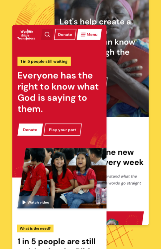
Ski Club needed a dynamic website that showed different content depending if they were a member or not, creating an awesome UX challenge for us. It was also technically challenging because we needed to use various APIs together to help create a unique and powerful offering.

Kickoff

Data analysis

After a successful Kickoff, we dived into their current site data to help fuel our ideas and thinking. Bev, analysed the GA4 data to get key information such as the most used device, audience ages and genders and where they are coming from. We were also provided user personas.

IA

Card sort and IA

With over 120 current pages, the site map needed a total rethink of how we logically group and organise the pages to create smoother navigation for users. We started with a traffic map, understanding what pages are popular and what aren’t, so we can streamline. This was followed by a card-sorting workshop with the SkiClub team where we organised buckets of pages into categories and culled or grouped low-traffic pages. This led to the IA, where we mapped out the sitemap, focusing on simplicity and grouping. It took 3 versions to refine and simplify the content to around 50 core pages.

User journeys

Creating task and journey maps

Due to the complexity of the site, we first mapped out each of the tasks and how they would need to complete those tasks. For example, some grouped tasks might be… I need Ski travel insurance, what are the packages, what am I covered for. Organising each of the tasks allowed us to create some user journeys through the content, helping visualise the flow. This was done alongside the sitemap to ensure journeys worked within the map.
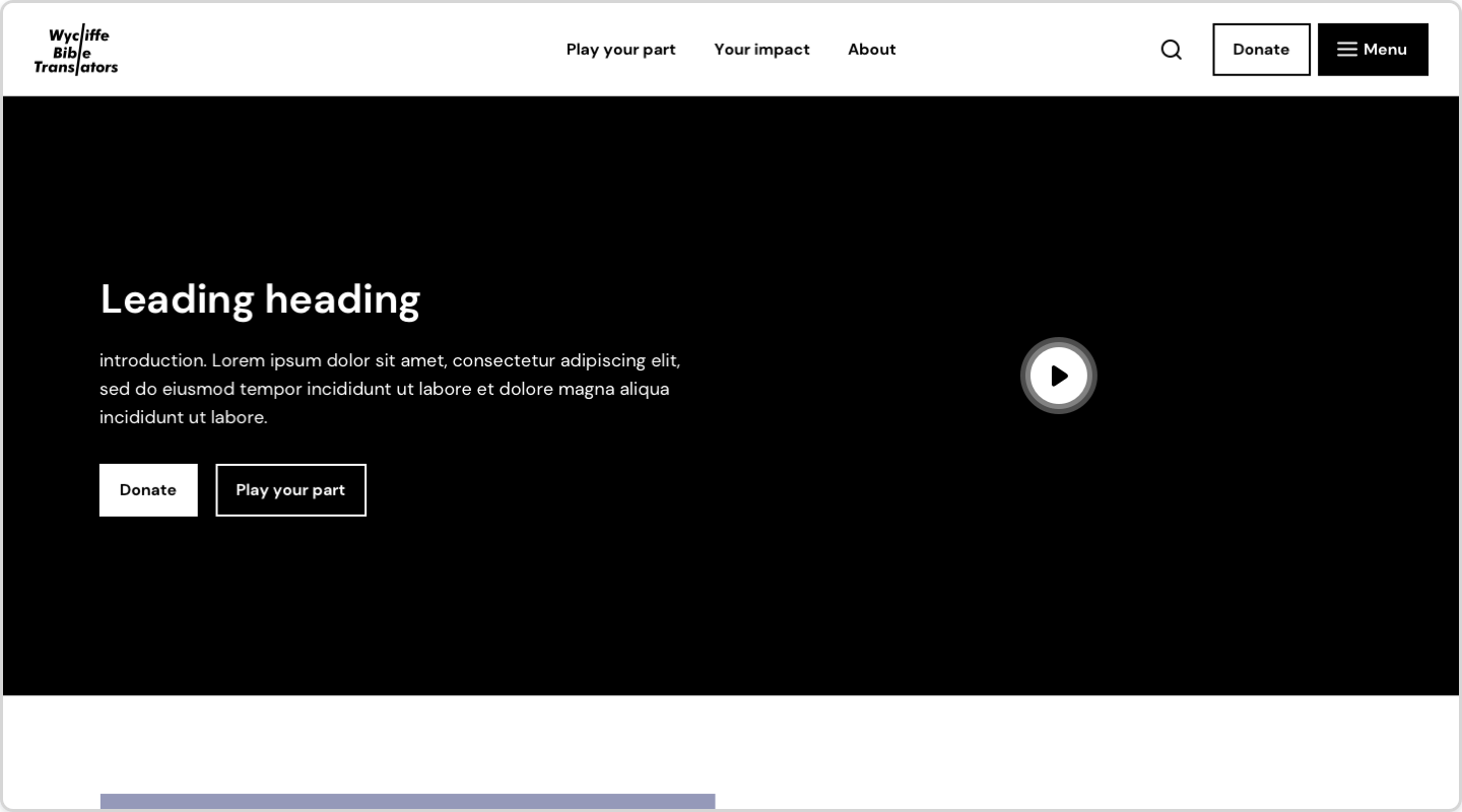
UX design

Planning content and designing wireframes

We moved on to the low-fi wireframing, creating layouts and component structures for the new Ski Club website and members area. Our focus was to design each of the user journeys and ensure content was lean, useful and provided lots of value to users. Providing value was key to creating an awesome experience for all user types. The UX design phase was a success as returning visitors increased after the launch.

UX and UI challenge

Dynamic pages

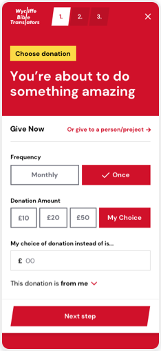
One of the main project challenges was we needed 2 designs per page. If a user was not logged in, it would show more sales content such as pushing to become a member and selling the benefits of membership (i.e. this is what you’re missing out on). In some cases to trigger more sign-ups, we allowed them access to valuable content, like weather and discounts but locked them out of advanced features to show what they were missing out on. If they were a member, we’d provide them with valuable and relevant content, getting value from their membership.

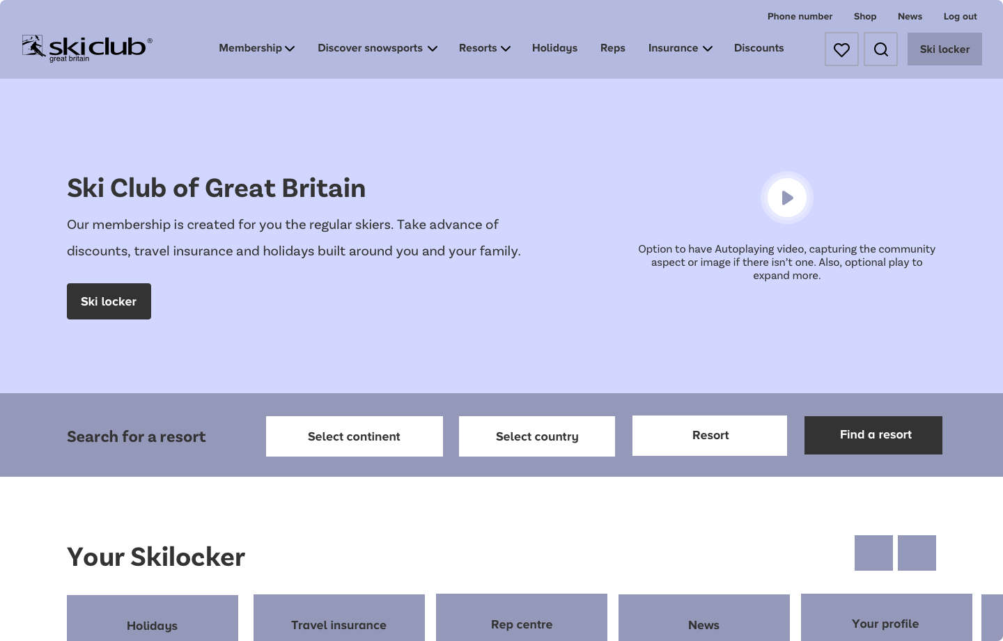
Key to the success was planning out both user journeys and mapping what content we needed to show on each page. When it came down to the UI, we opted for a clean and spacious look, with mostly white backgrounds, so the dynamic components could be displayed interchangeably and nothing would clash.
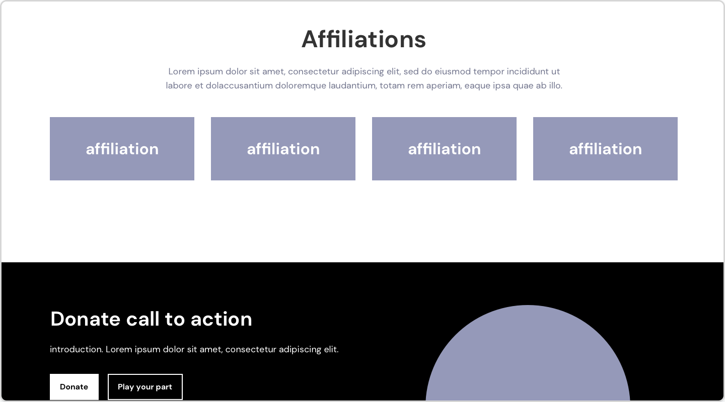
UI Design

Crafting a flexible and standout UI

We opted for a mobile-first approach as it was the most used device.When bringing the UI to life, we needed to consider the dynamic content and amount of content to ensure components didn’t clash or feel too content-heavy. Therefore, we opted for a simple colour pallet, and lots of generous use of white space to make it feel clean and easy for users to read content. There were many unique templates, so we designed a lot of them custom. However, for many of the content pages, we created a component library so they can easily create engaging pages for themselves. For these components, in the CMS, we added the ability to change and flex the background colours so that sections never clashed.

Key challenge

Holidays and resort design

One of the core offerings of the website and members’ area is resort information and holidays, with the two being linked. Planning-wise, we needed to create simple user journeys that flowed from resorts to holidays, to booking and to managing their holiday in the members’ area. We only showed what was necessary and tried not to overcomplicate any steps. We worked with the holiday team to try and simplify their forms for easier booking. Even though we wanted to streamline content, resorts and holidays both had tonnes of information and sections. Therefore, to keep the initial flow simple, we opted for a tabbed design. This meant, on the first tab, they could understand all the essential information they needed to complete the booking journey. Then in the other tabs, we can present extra information that users might need but isn’t essential. This created simple user journeys, whilst providing maximum value.
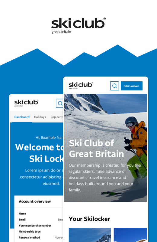
Members Area

Providing value, simply

The Members’ area or ‘Ski Locker’, was a dashboard where they can manage Holidays, Reps, Discounts, Insurance and more. A typical members’ areas have all things members in one place and all things not in another. The challenge with Ski Club was the member’s content was not only in the Ski locker but also on the website itself. Our main solution to this was dynamic content accompanied by lots of planning, wireframing and journey mapping. Through dynamic content, we were able to show members what they wanted and not confuse them with non-member content. For the Ski Locker itself, we created a simple dashboard that revealed relevant and new content, making them want to come back time and time again. We optimised multiple APIs to give them useful features such as insurance, reps and holiday management. Design-wise, we kept it clean with lots of spacing, so users weren’t overwhelmed with the amount of data in there.

Development challenges

Using multiple APIs together

Ski Club wanted to provide as much value as they could. However, to do so, they required multiple APIs to work together, creating technical challenges. Through this task, it was key to understand all the API requirements and limitations, so none of them clashed. Some of the APIs we used were Sugati to manage all their holiday bookings, Fonteva to manage memberships and Ski reps, Dot Digital for preferences, Stripe for payment methods and a unique weather API.

Overall, through technical planning and design to the technical limitations of each API, everything came together successfully. The only issue we had was the API for reps didn’t provide everything we wanted to give an awesome experience. Therefore, we bolted on those extra features with a custom solution within WPE, combining the two.

Support

Ongoing improvements

Overall, the process was complex, with lots of challenges along the way. All challenges were overcome through teamwork and working with the Ski Club to find solutions quickly. With Ski Club and many of our clients, we love working with teams to build something awesome for users. The Ski Club site was a great example of this, what was built is an amazing offering to the largest Ski member group in the world. We continue to work with Ski Club on improving their site via better UX and new features to excite their audiences.

Next project
Next project Next project Next project Next project Next project Next project Next project Next project

Wycliffe Bible Translators

Wycliffe’s website needed resonating visuals and storytelling so their cause appealed to their user, which in turn would increase donations. Also, their donation process needed to be slicker.

User journeys and personas

Mapping out the user journeys

We started with a fun user workshop with the aim to understand all their users journeys though the site. The journey was mapped so each persona could meet all their key tasks and goals in a logical order. We also thought of their emotions at every step so we could consider if they were frustrated or sceptical. Having the user personas and journeys allowed us to cull any pages that weren’t needed, make key pages in the user journey more prominent and allowed us to tailor the UI to their emotions.

Sitemap and content mapping

Organising and simplifying the site

The previous sitemap had lots of levels, and pages with varied, ungrouped content. To get to the final version (it took a lot to tame this beast), we discussed what pages could be grouped or removed, which gave us a good bunch for the card sort. The card sort helped organise and group all the pages. This highlighted we could group the navigation into 3 core areas. We then organised, simplified and adjusted the taxonomies over many revisions to make it as easy to navigate as possible. Once the site map was finished, it allowed us to do a content map, which organised the content so it was easy to find.

Cool board

Introducing the storytelling

Our task was to establish the brand and represent the diverse cultures Wycliffe helped to unlock. Before committing to any design, we created a cool board that expresses our visual direction. We were inspired by the vibrant colours and patterns of diverse cultures. Using these with a clean typeface and people-focused imagery, powerfully brought everything together, making the brand resonate with its users.

Wireframes

Putting the user journey first

In greyscale, we designed the backbones of the website that was tailored towards the user journey and content map. The benefit of wireframing was we were able to just focus on the structure, content, flow and hierarchy. After some quick iterations, we were happy with all the content being in the right place at the right time.

Visual design

Bringing the brand to life

We applied the cool board styling to the wireframes to bring the site to life. Our main focus was to create a clean and powerful user interface. We used people-focused images, along with the patterns and colours across the site to reinforce the message and create visual interest on every page. The patterns were useful as we were able to layer them behind certain elements to create depth. We were pleased with how the Red, Yellow and Orange worked together.

Donation flow workshop

Mapping a simple and logical route

To tackle the overcomplicated donation form, we had a workshop which firstly involved mapping out the previous form. From there, we were able to cull, simplify, group, rename and automate any steps. Normal donation forms just donate to the charity, however, this form required to donate to projects, people or where they needed it most. This added a layer of potential confusion and complexity, due to searching for projects and people. We solved this by leading with the most popular option (where needs it most) and then separating the projects and people into their own tab with extra UI complexity and functionality. This resulted in two tabs with each focused on its main task, making the form cleaner and more focused. We also found the most popular donation amounts, to reduce the user input.

Donation form design

Bringing the donation form to life

The main task was to balance a really easy-to-use form with a limited amount of input and bringing in some signals that the user is making an impact with their donation. Ways we made it more efficient were using switches and radio buttons where possible to reduce typing, using analytics for popular donations and a postcode address finder. To highlight the user is making a change, we brought in a quote section, in some empty space, that tells users the change donations have had on them. Lastly, on the donation amounts, we visually showed the impact of that amount such as £10 can buy X,Y,Z.

Next project
Next project Next project Next project Next project Next project Next project Next project Next project

MattressNextDay

MattressNextDay needed a user-friendly website that was easy to find and purchase products. Also, they needed their new brand baked in to give a fresh, modern and credible feel.

User research

Understanding the audience

We invited the MatressNextDay team in to help gather insights such as popular pages and key analytics. This allowed us to define the key tasks, journeys, goals and critical differences of their users. The whole process was beneficial later down the line as we identified critical aspects of the user journey such as the homepage, basket and checkout as key areas to improve.

Sprint 1

Redesigning the homepage

After the user research, we planned to work in sprints, focussing on core areas of the site. Sprint one involved redesigning the homepage. We started with mobile as that had the most users. One pain point was users not being able to quickly find products, so we dived into the analytics of popular pages. We then presented these popular ‘shop by’ sections on the homepage for quick navigation.

Sprint 2.1

The product listing page

Next, we focused on the products page. The main focus here was to improve the filtering of the products, so users can find what they want easily. We solved this by making the filters always visible (sticky), and logically ordered and hiding unpopular ones behind an advanced filter button.

Sprint 2.2

The product page

Our main focus was to simplify all the essential information, so it could be placed above the fold. This meant users only needed to read this information to purchase. We also made the images more prominent and stacked the essential ones, so the user could scan through them without clicking. Below the images, we placed all the other information within accordions so users could quickly scan and find any specific details such as specifications or return information. Lastly, reviews were key on this page to gain credibility, so we thought about how to best place them on the page.

Sprint 3

The Basket

The basket had a few extra challenges than a traditional basket. These included seamlessly adding in two extra services (mattress recycling and room delivery), if available for the Next day delivery and tree planting information. We solved this by logically displaying essential information so that the hierarchy and clarity were spot on. Also, colour-coding sections helped create a clear structure for the basket.

Sprint 4

The checkout

The current checkout had multiple steps over multiple pages. Our solution to make this quicker, cleaner and simpler was to make this a one-page checkout with different sections that could expand to review past information. We also tried to automate any steps such as a postcode finder. Lastly, we had to think about the best and most efficient way to select their custom delivery slot.

Sprint 5

Content pages

Now that the key purchasing flow was nailed, we focused on key content pages such as the delivery, about, contact and component library. We were able to bring in the brand and be more friendly and approachable. One of their key USPs is planting a tree with every order, so we designed a branded page that stood out from the rest of the website.

Sprint 6

Mattress finder

The Mattress finder is a bespoke tool for users to find their perfect mattress. Our task was to improve the efficiency of the tool but most importantly, make it an enjoyable, interactive experience that sparks excitement about what they are about to buy. We improved the UX by remapping the flow to make it simpler, categorised and more logical. We also focused on reducing the number of clicks. The UI was improved by bringing in colour to separate it from a normal form. We also introduced some icons so that users could understand each option quicker, which also made it more visually interesting. Each option was a large clickable area, so it was easy on mobile to select what they wanted. Lastly, we adjusted the results page to help show the best option for them. We continue to work with them on ways to make it better as more analytics come in.

Sprint 7 and beyond

Icon library

Across the site, they have lots of icons, especially on the product pages to help visually show features. They were very unique things like ‘horse hair mattress’ so we designed an icon library for them. We are still working with them on new features, icons and more to help improve their site, sprint by sprint.

Next project
Next project Next project Next project Next project Next project Next project Next project Next project

Gooey

Gooey, one of our digital partners, had an exciting brand makeover! It was our job to bring their brand to life with a slick, exciting and unique user interface that made them stand out in the digital market industry.

Brand

Expanding their vibrant brand

We explored how we can push the brand even further for their website. We defined the accessible digital colour pallet, icons and illustrations, creating brand consistency and impact.

User personas

Understanding target audiences

A persona workshop with Gooey was important at the start. We worked together to define who their users are, their goals, barriers and most importantly, key tasks on the site. Knowing key user tasks ensures the design is optimised toward making these as easy as possible.

Wireframing

Creating a blueprint structure

Wireframing involves planning out the structure of the site without focusing too much on layout and visual design. This allows you to quickly refine the pages, content and navigation early on. Getting the UX foundations right early on is key to any successful site.

Visual design

Thinking outside the box

Most websites have a white background. However, to make their exciting brand stand out from the crowd, we opted for the blue background. The coloured background allowed us to use multilayers, creating depth, hierarchy and also visual impact. The layers included a CSS gooey blob that animates, Gooey illustrations and white containers for long-form content.

Iconography

Making each service stand out

Gooey has 5 core services, so to make each one stand out, we assigned each one colour and shape, helping them are easily distinguished. This translated over to the case studies, so users can understand which service was used. Gooey’s sub-services were unique so we designed custom icons for them to help convey their offerings.

Improvements

Evolving the site to their needs

Since launch, we’ve worked with Gooey, to improve areas of the site. This included evolving the blog with more engaging components and brought through more imagery to make pages more engaging. We’ve also been working with Gooey as an SEO partner, bringing their expertise into our projects.

Next project
Next project Next project Next project Next project Next project Next project Next project Next project

Mountview

Mountview had some key challenges. Priorities included improving the user experience for student applications; build a more flexible CMS, and to create a platform to improve online sales.

Application Design

Booking flow was central to success

If we could carry users through the process better, and allow them to save as they go, we expected to see greater conversion and increased application numbers. We focussed on creating a solution that had these attributes.

Refine

Simplicity down to every detail

The booking flow was simplified to every detail. We removed any fields which weren’t essential, making the task less daunting. Fields were carefully thought out, making them easy to enter such as turning text fields into button options. Taxonomies and groups were carefully considered, ensuring they were easily understood. After refinement, the form was ready for visual design.

Component library

Systems not pages

We used a component design system approach to speed up site development, save time on content management and improve overall site performance. We also build our WordPress systems in the same way. Allowing the admins to create one piece of content once, and add it to any page, course or event as required.

The website

Putting it all together

Once we had all the components, we were able to quickly piece together all the pages with consistency and efficiency. The main benefit to having pre-defined components is it frees us up to easily test different layouts and user flows, ensuring each page is optimised towards the user goals.

In the first four months since launch, we saw an increase of over 20% in applications to our headline courses. We put this down, unequivocally, to the improved design and UX Red Bullet have brought to our website and application form.

Matthew Turnbull, Commercial Director
Next Project
Next Project Next Project Next Project Next Project Next Project Next Project Next Project Next Project

Focal data

The aim of the platform was to be a comprehensive survey creation and management tool, with complex analytical feedback and results.

Research & discovery

Understanding users and thier journeys

We identified key user personas, each with different tasks and capabilities. Some users are restricted to just viewing content, some could edit and manage their own accounts, as well as the accounts of their organisation.

We created user flows for each persona, capturing how their different capabilities manifested in their journey. We mapped how each screen, notification or email might be different or required, which all depended on the users account rights and flow through.

Wireframing

Nailing the stucture and language

The journeys were transformed into wireframes, focusing on the placement of elements and communication. We constantly questioned ourselves such as, do they know what screen they’re on and what to do next? What if errors are made and how they’re communicated?

We discovered the best language to use. For example, Login, Log in or Sign in? A challenge was to seamlessly communicate Focaldata approved accounts. Whilst waiting for approval, we introduced an onboarding step, keeping the journey flowing and minimising frustration.

UI design

The visual design framework

Following usability testing iterations of the wireframes, we added the visual layer. Focaldata used the Material UI framework, so our designs needed to correlate. The framework’s is built up of colours, type scales, interactions, errors, buttons and components. Our design speed drastically improved, allowing more focus on UX.

Always improving

Iterating design sprints

After the initial launch, we’ve worked closely with Focaldata, iterating through several design sprints with specific aims. Overall, the core aims are improving usability, streamlining user journeys and adding new features. Notably, the design has become simpler and cleaner to improve usability, organisation and content digestion.

Next project
Next project Next project Next project Next project Next project Next project Next project Next project

DMA BiO Design system

DMA’s maintenance app BiO is already an existing web app but needed a UX team to give it a revamp and streamline and simplify the user journeys.

Discovery & research

The discovery phase

We initially conducted some engineer interviews and gathered some insight into some of their issues with the current BiO app. We then used these to form key tasks and personas for the engineers.

User journeys

Mapping the journeys

Because BiO is was an enormous app, we narrowed down our scope main flows to focus on and develop.

These were the ones we felt could do with the most improvement and have the most benefit for the users and the business.

  • Global Navigation
  • Starting job / updating job status
  • Inspect job / completing checklist
  • Raising a job
  • Inspecting a quote
Sketching

Planning out the stucture

We sketched out the system as this is the quickest way to plan out what we wanted to create. Through sketching we can save lots of time later down the line as it enables us to test new ideas and layout quickly. It also helps us understand the whole system very quickly. Knowing the system as a whole helps us make better decisions as we’re thinking of the system as a whole.

Wireframing

Bringing the sketches to life

Once we sketched out the system, we brought them to life using our design programs. We use figma as we can quickly mock them up and then turn them into a clickable prototype. Having a clickable prototype early on in the process as it enables us to test and change UX issue early on, without committing too much time.

UI Design

Adding in the design system

Once we tested and were happy with the wireframes, we applied colours and other visual elements to bring the designs to life. The way we set it up in Figma was through the use of reusable components. This means we only have to update the original designed element and it will update every use of it in the mock ups.

Components

Creating a design System

We already had an existing app and components within that we just needed to make it more usable, this meant starting from the ground up. We built everything with the Atomic Design System in mind. Starting off granular and building up to larger components.

Everything was from scratch: buttons to inputs to sliders, so we could have full control and scalability over everything.

Testing flows

Raising a job

Raising a job was one of the crucial flows of the platform. Therefore, we created a high fidelity mock up of the flow in Figma. We were then able to test this and get this right before building it with code.

Testing flows

Job checklist

Another crucial flow was marking of a task from the job checklist. We also mocked this up and tested it to ensure it was efficient and easy to understand.

Click testing

Validating our assumptions

Since prototyping we’ve been able to gather insights from real engineers putting them through usability hub and collecting heatmaps. We were then able to determine common pain points which we ammended.

Next project
Next project Next project Next project Next project Next project Next project Next project Next project

KCC Trading Standards Checked

DMA’s maintenance app BiO is already an existing web app but needed a UX team to give it a revamp and streamline and simplify the user journeys.

The problem

Not searching for traders

Kent County Council’s Trading Standards site was relatively new and had been building traction by gathering a list of registered traders. KCC had been working on social media campaigns to increase consumer traffic, however tracking showed that although users were clicking through to the site, they were not then searching for local traders.

Discovery & research

The discovery phase

We initially conducted some engineer interviews and gathered some insight into some of their issues with the current BiO app. We then used these to form key tasks and personas for the engineers.

User journeys

Mapping the journeys

Because BiO is was an enormous app, we narrowed down our scope main flows to focus on and develop.

These were the ones we felt could do with the most improvement and have the most benefit for the users and the business.

  • Global Navigation
  • Starting job / updating job status
  • Inspect job / completing checklist
  • Raising a job
  • Inspecting a quote
Sketching

Planning out the stucture

We sketched out the system as this is the quickest way to plan out what we wanted to create. Through sketching we can save lots of time later down the line as it enables us to test new ideas and layout quickly. It also helps us understand the whole system very quickly. Knowing the system as a whole helps us make better decisions as we’re thinking of the system as a whole.

Wireframes

Mapping out the blueprint

To validate our initial research and planning, we create a rough structure to the site and admin panel, focusing on a seamless user journey through the content for users to reach their goals. We created a clickable prototype to test our ideas, helping us find issues early on without investing too much time into the visual details.

UI design

A website to suit two audiences

The website had two core audiences, traders and residents. We split the site into two core areas so they could focus on their specific goals. The residents’ area focused on finding traders information really easy and then getting in touch. The main way we did this was making the process as simple as possible. The traders’ area focused on selling the benefits of signing up and then logically placing calls to action in the right place.

UI design

Increasing the number of applications

To sign up to the platform, we needed to get a lot of information from the trader to help sell their service. We logically planned out all the information and grouped all related questions to help separate the form into manageable chunks. Each question was carefully thought out so nothing was misinterpreted. From this, we were able to match the question to the most efficient input method, automating the user’s input.

UI design

Ensuring data is easily managed

If the platform was hard to manage, they may not stick around as this would become an unessasary task. Therefore, it was vital that the admin area allowed the trader to easily view all their applications, see profile traction, update their profile and also upsell their account level. We tried to keep this as simple and as useful as possible, so the trader wasn’t overwhelmed yet could get the maximum out of it.

Component library

Creating the different variations

The forms were vital within this process, so we created a component library to help plan out all the different variations in the form. This ensured that there was consistency across the forms. Furthermore, it was vital to ensure we planned out all the validation and states to ensure users were educated and guided through the application form.

Testing

Validating our thinking

As soon as we had a robust prototype of all the screens, we ran first click user testing to validate our decisions. This is a valuable step before venturing into the build phase because it allows us to make quick and efficient iterations, based on real users’ feedback. We reviewed the taxonomies and were able to tweak some labels to further increase the distinction between sections of content. We also made some minor adjustments with some call to actions to minimise any chance of user frustration. It is always amazing to run user testing – with targeted questions we always get very useful results and it provides an excellent way to fine-tune.

Next project
Next project Next project Next project Next project Next project Next project Next project Next project

Quest

DMA’s maintenance app BiO is already an existing web app but needed a UX team to give it a revamp and streamline and simplify the user journeys.

Discovery & research

The discovery phase

We initially conducted some engineer interviews and gathered some insight into some of their issues with the current BiO app. We then used these to form key tasks and personas for the engineers.

Validating ideas

Understanding the audiences

Having run the event in the Alps for Ski for Sadie, using the same technology, we already had a bunch of rich user insight to start forming the direction for Quest. During the beta launch of Quest in lockdown 1, we piloted the app in a few locations around Kent, onboarding real users through Facebook adverts to gather as much insight as we could. Early findings showed young families were a huge take up as it gave children a new way to explore areas they already knew. Lockdown meant people couldn’t travel, so having something ‘new’ to do on their doorsteps saw an organic spike in users. At that point, we knew Quest would be a hit. No marketing spend, no brand exposure, but people were using it.

User journeys

Mapping the journeys

Because BiO is was an enormous app, we narrowed down our scope main flows to focus on and develop.

These were the ones we felt could do with the most improvement and have the most benefit for the users and the business.

  • Global Navigation
  • Starting job / updating job status
  • Inspect job / completing checklist
  • Raising a job
  • Inspecting a quote
UI Design

Baking in the brand

Once we tested and were happy with the user experience, we applied the Quest branding to the app and other visual elements, like animations to bring the designs to life. Moments of ‘joy’ are so important when engaging with users.

UI Design

Adding in the design system

Once we tested and were happy with the wireframes, we applied colours and other visual elements to bring the designs to life. The way we set it up in Figma was through the use of reusable components. This means we only have to update the original designed element and it will update every use of it in the mock ups.

We have developed a great working partnership with ‘Quest’ along with their dedication, guidance, communication and support which has had a great impact on delivering the product to a great standard. This has given our targeted demographic of guests a great experience which we would not be able to provide without the Red Bullet & Quest team.

Ryan Higgins, Regional Entertainment Manager @ Park Holidays UK
Next project
Next project Next project Next project Next project Next project Next project Next project Next project

Basket app

DMA’s maintenance app BiO is already an existing web app but needed a UX team to give it a revamp and streamline and simplify the user journeys.

Our role

Defining the initial UX & branding for the mobile app

We were tasked with performing the discovery, branding and UX design of Basket with the browser extension to come at a later date. The app would be native across both IOS and Android and the front-end would be made in Flutter by their dev team.

For the UX – we championed the wireframes, user flows and information architecture for the app itself. For the brand – we crafted the messaging, tone of voice, logo, palette and typography.

Discovery & research

The discovery phase

We initially conducted some engineer interviews and gathered some insight into some of their issues with the current BiO app. We then used these to form key tasks and personas for the engineers.

User journeys

Mapping the journeys

Because BiO is was an enormous app, we narrowed down our scope main flows to focus on and develop.

These were the ones we felt could do with the most improvement and have the most benefit for the users and the business.

  • Global Navigation
  • Starting job / updating job status
  • Inspect job / completing checklist
  • Raising a job
  • Inspecting a quote
Sketching

Planning out the stucture

We sketched out the system as this is the quickest way to plan out what we wanted to create. Through sketching we can save lots of time later down the line as it enables us to test new ideas and layout quickly. It also helps us understand the whole system very quickly. Knowing the system as a whole helps us make better decisions as we’re thinking of the system as a whole.

UI Design

Baking in the brand

Once we tested and were happy with the user experience, we applied the Quest branding to the app and other visual elements, like animations to bring the designs to life. Moments of ‘joy’ are so important when engaging with users.

Prototyping

Sharing to basket

Another flow that we needed to figure out was how to add a product to Basket from both inside and outside the app. This used the native “share” feature on both IOS and Android, and we needed to design what this flow looked like. This is an interaction of how we envisioned this would work.

Next project
Next project Next project Next project Next project Next project Next project Next project Next project