DMA BiO Design systemApps
A maintenance management app

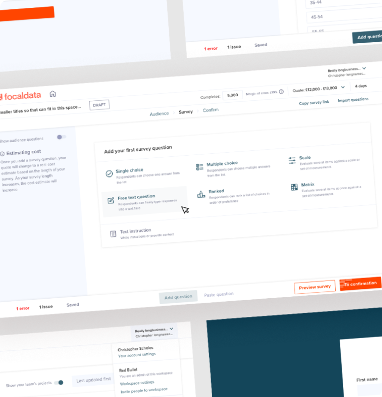
DMA’s maintenance app BiO is already an existing web app but needed a UX team to give it a revamp and streamline and simplify the user journeys.
Discovery & research
The discovery phase
We initially conducted some engineer interviews and gathered some insight into some of their issues with the current BiO app. We then used these to form key tasks and personas for the engineers.

User journeys
Mapping the journeys
Because BiO is was an enormous app, we narrowed down our scope main flows to focus on and develop.
These were the ones we felt could do with the most improvement and have the most benefit for the users and the business.
- Global Navigation
- Starting job / updating job status
- Inspect job / completing checklist
- Raising a job
- Inspecting a quote

Sketching
Planning out the stucture
We sketched out the system as this is the quickest way to plan out what we wanted to create. Through sketching we can save lots of time later down the line as it enables us to test new ideas and layout quickly. It also helps us understand the whole system very quickly. Knowing the system as a whole helps us make better decisions as we’re thinking of the system as a whole.

Wireframing
Bringing the sketches to life
Once we sketched out the system, we brought them to life using our design programs. We use figma as we can quickly mock them up and then turn them into a clickable prototype. Having a clickable prototype early on in the process as it enables us to test and change UX issue early on, without committing too much time.

UI Design
Adding in the design system
Once we tested and were happy with the wireframes, we applied colours and other visual elements to bring the designs to life. The way we set it up in Figma was through the use of reusable components. This means we only have to update the original designed element and it will update every use of it in the mock ups.

Components
Creating a design System
We already had an existing app and components within that we just needed to make it more usable, this meant starting from the ground up. We built everything with the Atomic Design System in mind. Starting off granular and building up to larger components.
Everything was from scratch: buttons to inputs to sliders, so we could have full control and scalability over everything.


Testing flows
Raising a job
Raising a job was one of the crucial flows of the platform. Therefore, we created a high fidelity mock up of the flow in Figma. We were then able to test this and get this right before building it with code.


Testing flows
Job checklist
Another crucial flow was marking of a task from the job checklist. We also mocked this up and tested it to ensure it was efficient and easy to understand.
Click testing
Validating our assumptions
Since prototyping we’ve been able to gather insights from real engineers putting them through usability hub and collecting heatmaps. We were then able to determine common pain points which we ammended.