Transforming e-commerce giants UX & UI

MattressNextDay needed a user-friendly website that was easy to find and purchase products. Also, they needed their new brand baked in to give a fresh, modern and credible feel.
Launch projectUnderstanding the audience
We invited the MatressNextDay team in to help gather insights such as popular pages and key analytics. This allowed us to define the key tasks, journeys, goals and critical differences of their users. The whole process was beneficial later down the line as we identified critical aspects of the user journey such as the homepage, basket and checkout as key areas to improve.

Redesigning the homepage
After the user research, we planned to work in sprints, focussing on core areas of the site. Sprint one involved redesigning the homepage. We started with mobile as that had the most users. One pain point was users not being able to quickly find products, so we dived into the analytics of popular pages. We then presented these popular ‘shop by’ sections on the homepage for quick navigation.
The product listing page
Next, we focused on the products page. The main focus here was to improve the filtering of the products, so users can find what they want easily. We solved this by making the filters always visible (sticky), and logically ordered and hiding unpopular ones behind an advanced filter button.

The product page
Our main focus was to simplify all the essential information, so it could be placed above the fold. This meant users only needed to read this information to purchase. We also made the images more prominent and stacked the essential ones, so the user could scan through them without clicking. Below the images, we placed all the other information within accordions so users could quickly scan and find any specific details such as specifications or return information. Lastly, reviews were key on this page to gain credibility, so we thought about how to best place them on the page.
The Basket
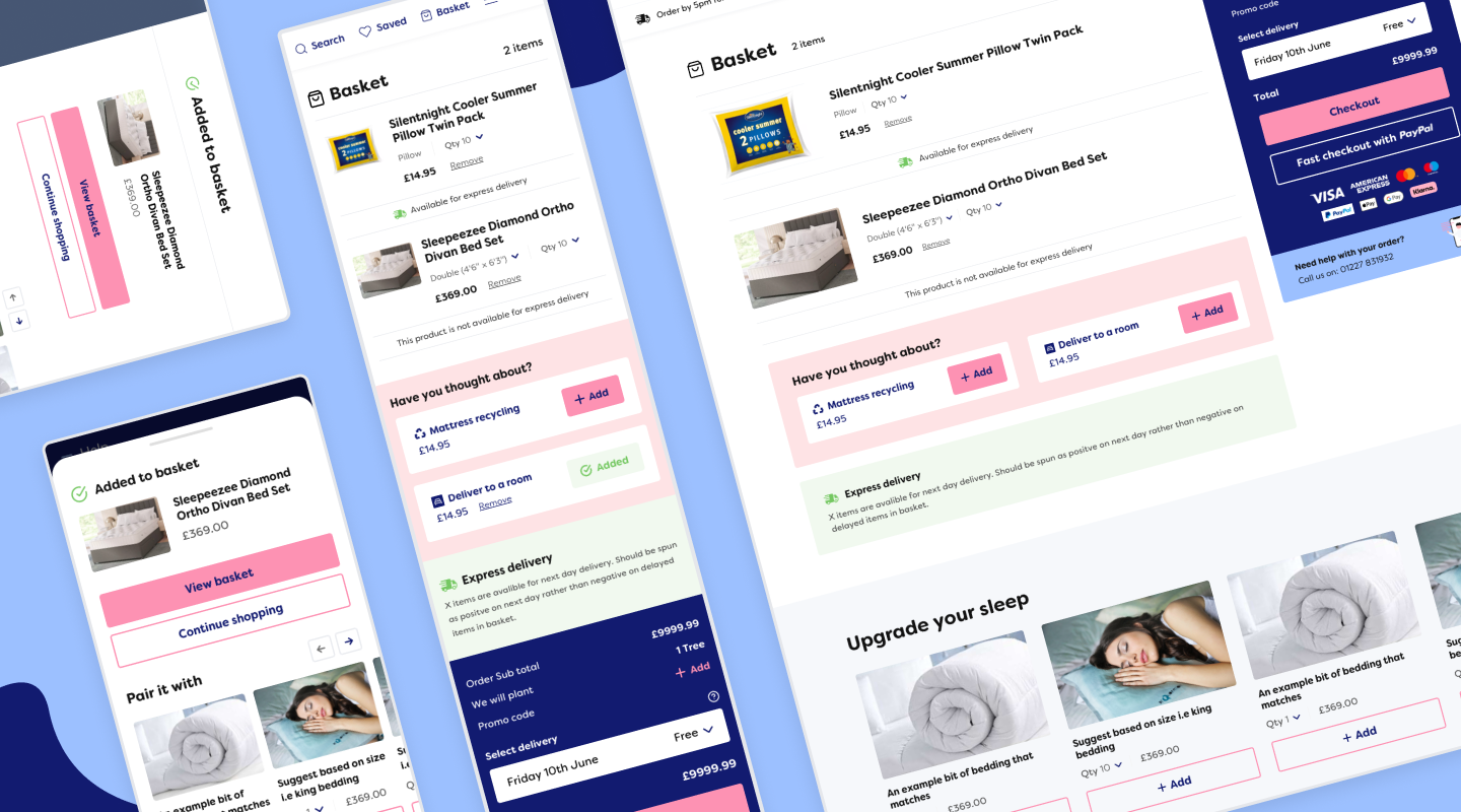
The basket had a few extra challenges than a traditional basket. These included seamlessly adding in two extra services (mattress recycling and room delivery), if available for the Next day delivery and tree planting information. We solved this by logically displaying essential information so that the hierarchy and clarity were spot on. Also, colour-coding sections helped create a clear structure for the basket.

The checkout
The current checkout had multiple steps over multiple pages. Our solution to make this quicker, cleaner and simpler was to make this a one-page checkout with different sections that could expand to review past information. We also tried to automate any steps such as a postcode finder. Lastly, we had to think about the best and most efficient way to select their custom delivery slot.

Content pages
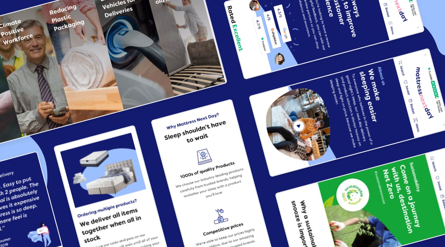
Now that the key purchasing flow was nailed, we focused on key content pages such as the delivery, about, contact and component library. We were able to bring in the brand and be more friendly and approachable. One of their key USPs is planting a tree with every order, so we designed a branded page that stood out from the rest of the website.

Mattress finder
The Mattress finder is a bespoke tool for users to find their perfect mattress. Our task was to improve the efficiency of the tool but most importantly, make it an enjoyable, interactive experience that sparks excitement about what they are about to buy. We improved the UX by remapping the flow to make it simpler, categorised and more logical. We also focused on reducing the number of clicks. The UI was improved by bringing in colour to separate it from a normal form. We also introduced some icons so that users could understand each option quicker, which also made it more visually interesting. Each option was a large clickable area, so it was easy on mobile to select what they wanted. Lastly, we adjusted the results page to help show the best option for them. We continue to work with them on ways to make it better as more analytics come in.
Icon library
Across the site, they have lots of icons, especially on the product pages to help visually show features. They were very unique things like ‘horse hair mattress’ so we designed an icon library for them. We are still working with them on new features, icons and more to help improve their site, sprint by sprint.


