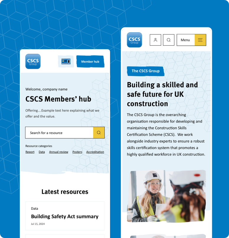
Youth Futures FoundationWebsite
Shaping a complex website around six users
YFF’s disjointed legacy site was blocking access to critical resources. We replaced assumptions with intensive user research. By structuring the platform around six core user types, we transformed complexity into a streamlined, high-impact tool.
Launch project Discovery workshop
Unlocking alignment through collaboration
We kicked off the project in London with a hands-on session to align on goals and understand the specific hurdles facing YFF’s users. The critical task? A physical card sort of the entire existing sitemap. By physically regrouping pages into logical pockets of information with the YFF team, we rapidly identified what to keep, cut, or consolidate, ensuring the new structure was solid from day one.

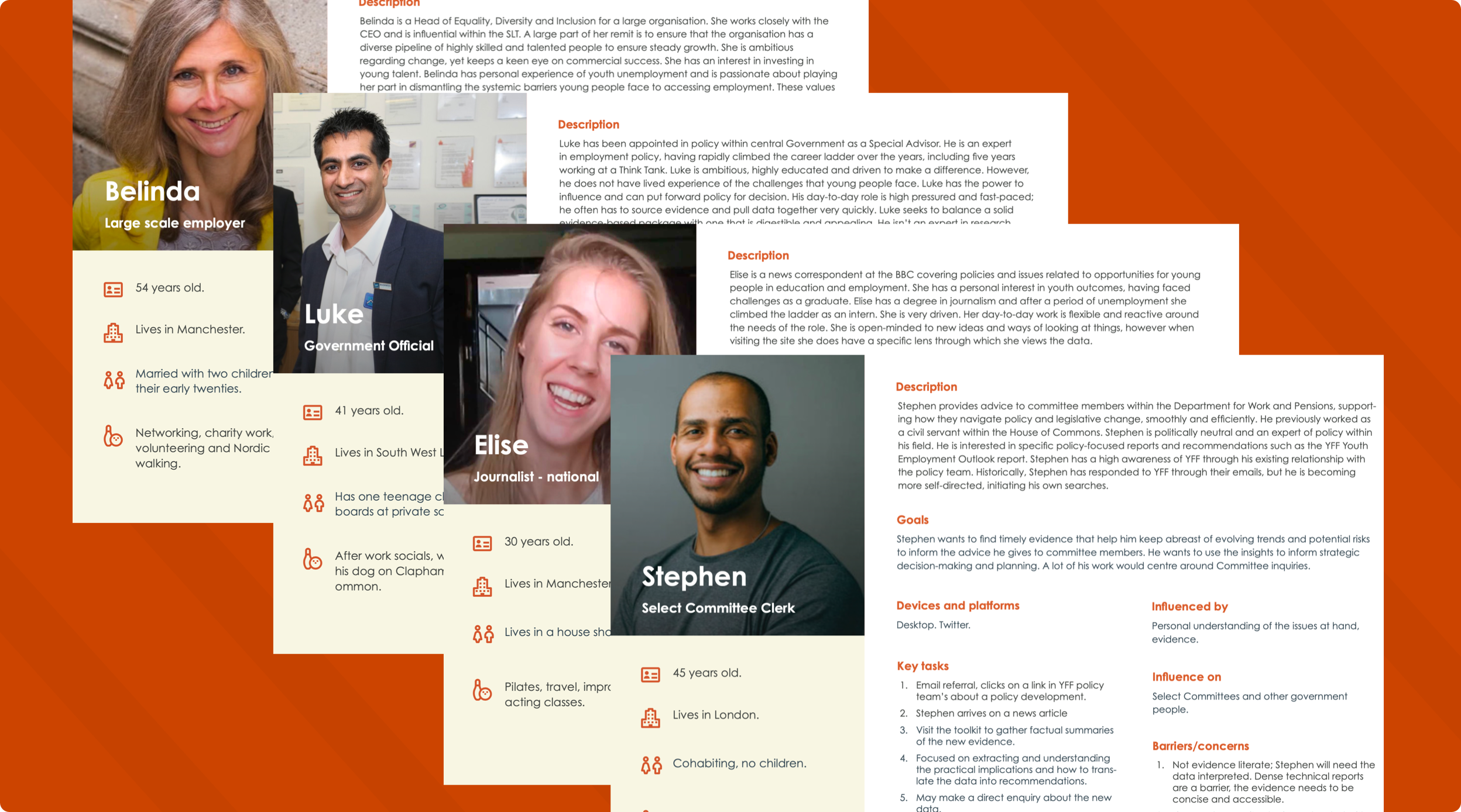
User definition
Defining the six core users
We hosted an online workshop to define the six core user types, plus highlight some secondary users too. Using Miro, the YFF team helped us map out goals, barriers, and key tasks for each user type. These insights evolved into robust User Personas, acting as the blueprint to tailor the entire digital experience around specific human needs rather than internal organisational structures.

Journey mapping
Mapping the critical path
With the personas set, we mapped six specific user journeys to determine exactly what information was needed, and when. This crucial step revealed the necessity for dedicated ‘Information For’ pathways. These user-based pages, acted as a specific launch pad to fine the information they needed quickly, without hunting around the site.


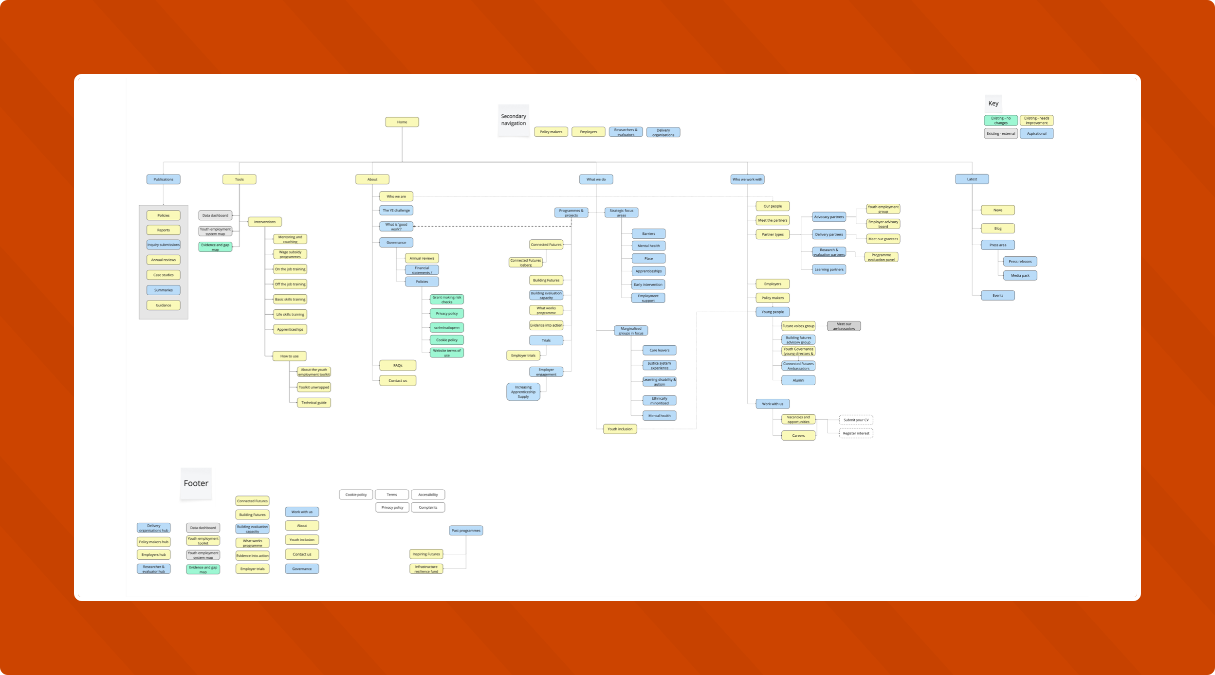
Information Architecture
Four iterations to clarity
The sheer scale of the content required rigorous refinement. We worked through four iterations of the sitemap, simplifying and reorganising at every stage. Because we’d nailed the user journeys, we could place granular data in logical areas. We ensured that, despite the volume of content, users can find exactly what they need without friction.
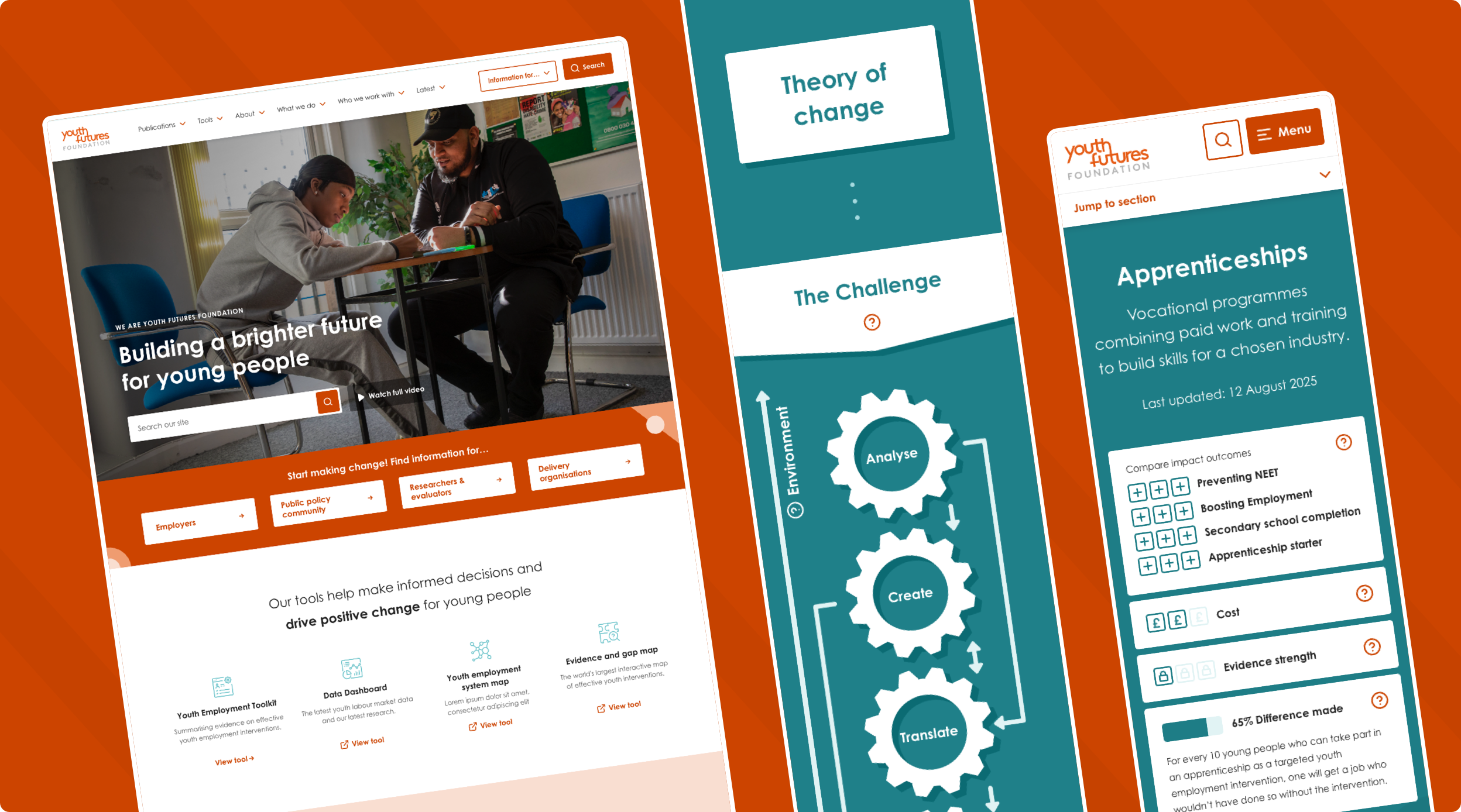
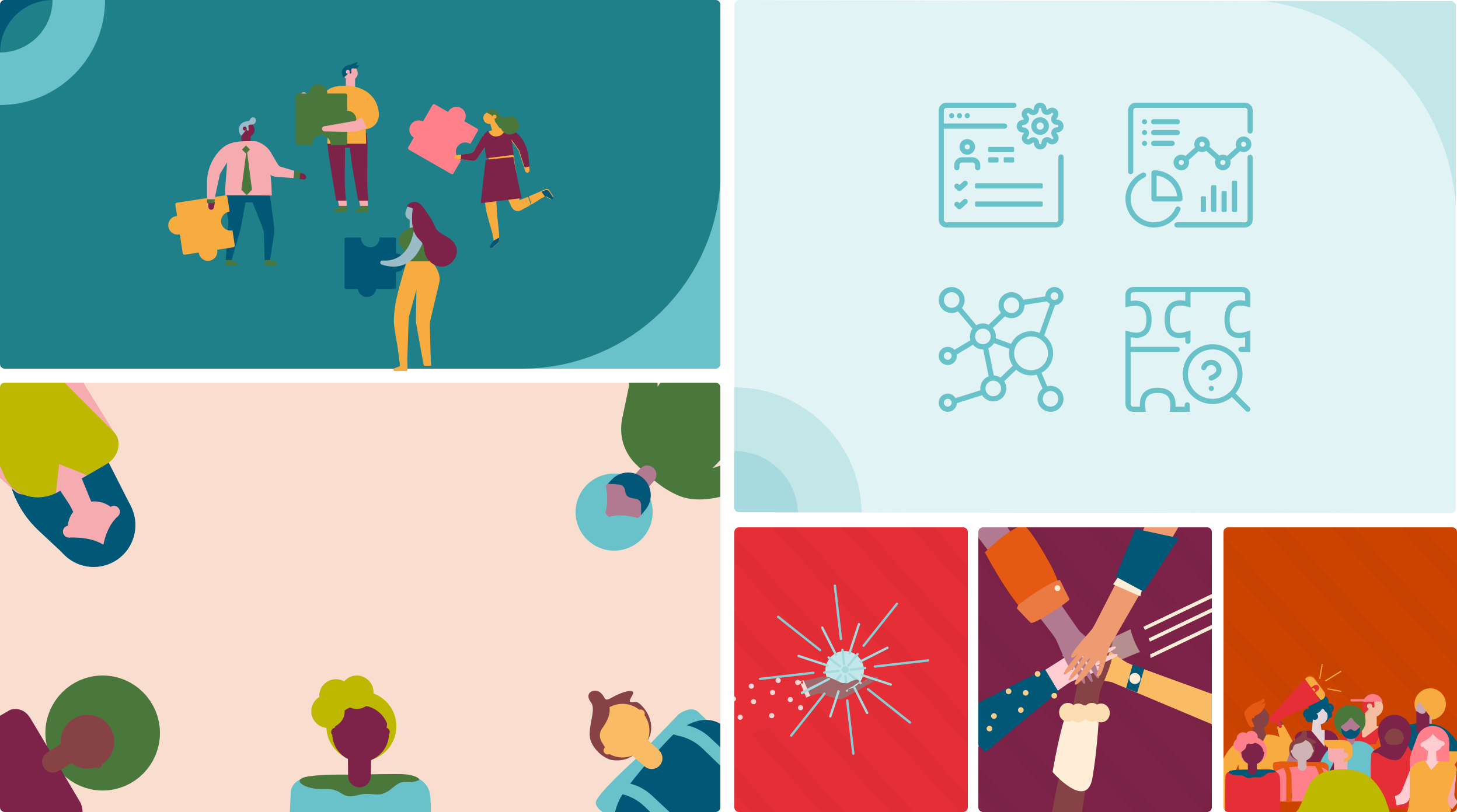
Visual Identity
Modernising the brand experience
YFF needed a digital presence that was both authoritative and approachable. We uplifted the brand by integrating its distinct illustrations and patterns directly into the UI. We also designed a custom suite of icons to convey complex messages quickly, ensuring the site feels engaging, modern, and friendly while retaining professional credibility.
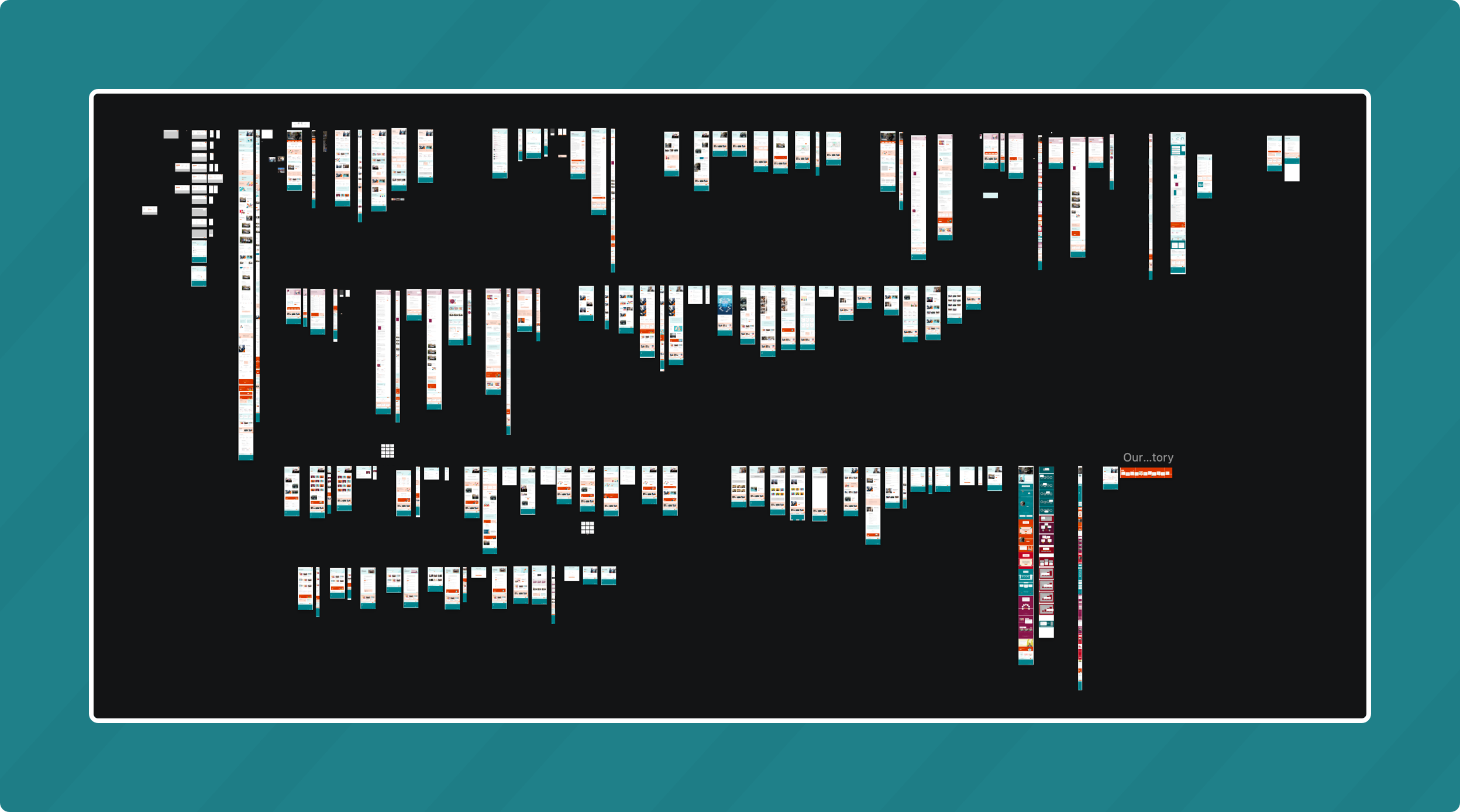
UI Design
A scalable design system
As one of our most extensive projects to date, the sheer volume of screens, showcased below, demanded a rigorous approach. We started with robust components first to ensure that everything we designed going forward was visually consistent. We then designed all the core templates around the user journeys, ensuring the system is scalable for future in-house management without breaking the visual language.
UX Solution
Launchpads for each user type
A standout success of the project. To prevent users from drowning in data, we developed dynamic ‘Information For…’ landing pages. These hubs instantly aggregate relevant content and useful links for specific personas. It’s a straight-talking solution that respects the user’s time and delivers value immediately.

Digital Strategy
Bringing the vision to life
Post-launch, YFF needed to share their vision without relying on a dry PDF. We built an immersive, interactive strategy page using animation and a guiding ‘dotted line’ graphic to lead the eye. By hiding dense detail behind interactive elements, we kept the experience engaging and digestible while still delivering the full strategic picture.
We continue to work alongside YFF as their long-term partner, using real-world data to refine the platform and ensure it keeps delivering for the youth of the UK.